
In a world drowning in images, what catches your attention and makes you say “wow”?
Colours are beautiful, so more colours must be better, right? If you take any nicely composed landscape photo taken during the magic hours of sunset or sunrise and turn up the color saturation and contrast, the photo will have more impact. With more vivid colours, brighter whites and darker darks, the image will jump out at the viewer, and they will be amazed that such a beautiful scene exists.


Sunset at Anderson Bottom on the Green River, Canyonlands National Park, Utah.
Except that that scene did not exist like that. The super saturated image is a lie.
In a world where everybody wants more, faster always seems better, and reality is too boring, image processing instantly solves the problem and makes images hyper-realistic.
No. Just say no.
Reality is a beautiful thing, and it doesn’t have to be enhanced and boosted. Just like foods, the best cuisine is often simple, with clean, natural ingredients and subtle flavors. Food doesn’t have to be loaded with sugar and saturated with fat to be tasty, and images don’t need to have super-saturated colours far beyond reality to be beautiful.
Black and white
The classic, high-contract black and white look is certainly a modification of reality. In the old days, the masters of film used color filters to modify the contrast of a scene, while today we use color mixing of digital colours, to create the equivalent effects of darkening the sky, increasing the contrast, and adding impact to the image.


For me, a black and white image conversion modifies reality through simplification and reduction rather than boosting and exaggeration. It purifies and adds clarity, rather than wrapping it in bacon and deep-frying it.
Normalization
No matter what it is, as soon as you have it for long enough, it becomes normal. This applies to everything from images to possessions to societal behavior.
After looking at it on a big screen for a few minutes, the super-saturated image looks normal, and the realistic image looks flat and boring. Alternately, after staring at the natural image, it too looks beautiful and real, and by comparison the saturated image looks garish and cartoonish.
Choose reality, and say no to cartoon coloured landscapes.
The same concept of normalization applies to and explains our materialistic society; why the thrill of buying the latest phone, or car, or fashion, or whatever toy tickles your consumer fancy today wears off immediately, and after a few weeks you’re left craving the next shiny distraction.
Just say no to that craving for the latest shiny toy.
Your choice
Ultimately, photography is just painting with light, and there is no right or wrong.
The camera captures the scene, and the way that capture is processed by the photographer is part of what determines the style of the image.
And the viewer chooses to like a style or not.
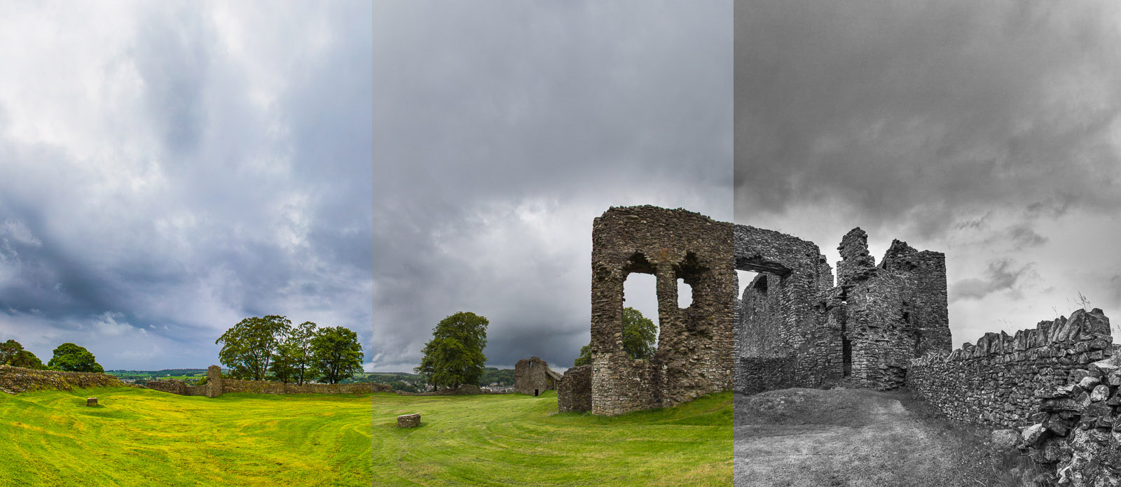
The 12th century New Castle, Kendal, England. Over-saturated, realistic and black and white processing.
I choose to embrace reality by processing colour images so that they respect the scene as I remember seeing it. I love black and white images for the way that removing colour simplfies an image down to the basics of form and texture, but I think that garish colours belong to the world of cheap plastic toys and cartoon characters. I have no interest in portraying Nature in such an artificial way.
Ultimately, super-saturated images are just another instance of the old adage that if something appears too good be be true, it probably is.
– Darren Foltinek,
March 2017